iPhone experiment in progress: a widget-based home screen
Recently, I came across a YouTube video hawking the concept of a widget-based home screen for your iPhone. For me, it’s taken a few years for enough widgets to come out, mostly from third-parties, to make widgets useful beyond a single block on your home screen. But I wrote down the idea, and a few days ago, I decided to try it out.
Long ago I became a convert of the single home screen and using the App Library for every thing else. It’s very fast to flick down and then tap 3 letters to conjure an app by search as well, so I picked my most used 18 apps and made a wide Smart Stack of widgets to go across the top. I turned off most of my anxiety-inducing push notifications red badges years ago. Only a hand picked few notifications ever appear on the home screen, and the remainder get shown in summaries at the start and end of the day. I removed my mail apps from the home screen as well. I do have VIP lists set up so I do get a red badge for truly important emails (which also have permission for push notifications.) But could I further reduce what shows on the home screen?
After four days or so, I’m quite happy with it. My initial worry was feeling overwhelmed by a lot of information. In fact, I feel less like I have a bunch of apps that I should tap into “just to check” when I am there. I do use a lot of apps regularly. The 18 I mentioned above… really are the most used, but there are several apps I use several times daily that still don’t make the previous (or current) home screen cut.
Let’s take a look at how I’m doing this. First thing to note is each block is a stack. I have all stack widget suggestions turned off, but each stack has “Smart Rotate” on (where iOS tried to guess which widget is most important to show you at a given time.)
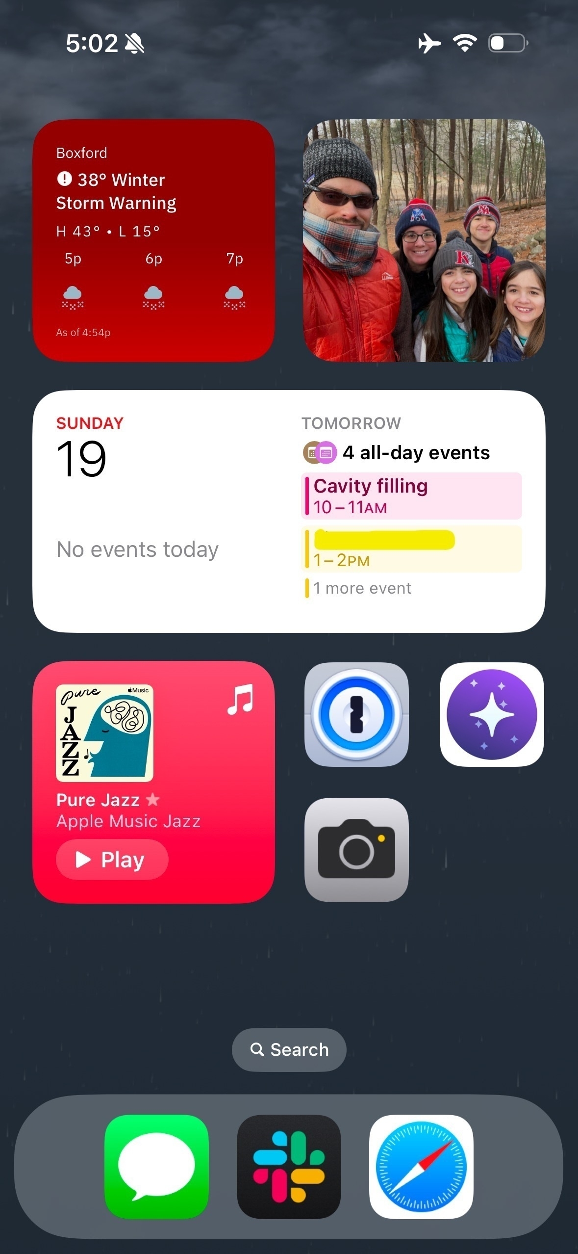
Top Left is my weather stack. I have The Weather Channel (for obvious reasons), RadarScope Pro showing all of the KBOX sweep, and Tempest, which shows live weather data from my backyard station.
Top right is a random combo. I use the Wikipedia (official) app daily, and their only widget is “Photo of the Day” so I just went with it. Since I also needed a block to access my Photos app, and the only option there is for it to show you random photos (although you can narrow the randomness to within a folder), I figured let’s stack to the two random photo widgets together to create a little home screen decoration corner.
The next row is a wide widget stack, with Apple Calendar (personal calendars, reminders hidden), Google Calendar (work calendar) and Apple Reminders, set to Scheduled. I am a heavy Reminders user. Lastly, the Contacts widget configured with your family’s avatars and their Find My locations.
Bottom left is my “listening” stack. Apple Music, Apple Podcasts, and a Shortcut widget with two app launchers for apps without widgets that I needed to get on here: Sonos and Live Phish.
From here I had to decide what to do about 6 apps I wanted on the home screen but don’t have widgets, or in one case, didn’t want as a widget (Slack). So I just distributed them as icons across the bottom. A couple years ago I realized that your most frequently used things should be at the bottom for easiest one-handed access.
Left-to-right, top to bottom that’s 1Password, Orion, and Camera, and in the dock, Messages, Slack, and Safari. With the exception of Orion (which I will explain in a moment), these are some of my most used apps. Having them at the bottom for easy thumb access is intentional.
Three important apps were cut from the home screen, and we’ll see for how long: Phone, Drafts, Apple Notes. Although I don’t use my iPhone as a phone a lot, I’m pretty sure I’ve kept it on my home screen anyhow since 2008. I think this is mostly to see red badges for missed calls and unlistened-to voicemail. This visibility is particularly important because I find since switching to Verizon Wireless a couple years ago, late- or no notification of voicemails is fairly chronic, on both my and my wife’s phones. If one of these three apps returns, I’d bet on Phone for this reason, probably in the far-left dock slot.
Drafts and Apple Notes I use a lot, but a little less on my phone than on my Mac or iPad. We’ll see if I miss them on the home screen.
Potential Questions and Answers
Why put the camera icon here? There are so many ways to launch it!
Fair question. You could use the lock screen, Control Center, or the action button on my iPhone 15 Pro to get at the camera. The answer is… I feel like I need it everywhere. My dog will only do that adorable thing for seconds.
Why does someone who supports indie developers use Apple Podcasts? I have paid for Overcast from Marco Arment for… years and years. I wasn’t enamored with his recent redesign, but it wasn’t horrible. Big corporations forced my hand. Tesla added Apple Podcasts integration, and I am a frequent car listener, and I don’t want to be messing with Bluetooth controls while driving. Fortunately, Apple Podcasts is a lot more full featured than previously, so I’m really only giving up Smart Speed (which Overcast does very well) and a slightly nicer UX. Since I don’t want to maintain two lists of the same podcasts for home and auto, Marco had to go. I’m sure he won’t miss me: he certainly never replied to a single bug report or support request of mine, as a paying user for a decade.
What about that widget-only page to the left of the home screen?
I use that too, but rarely. I have four wide widgets there, no stacks. From top to bottom, not pictured, Tesla, Fitness, Files and Batteries.
What’s that Orion app?
Thanks for reminding me to get back to that. Orion is a full web browser made by Kagi. I started experimenting with their browser after hearing Kagi’s founder Vladimir Prelovac on John Gruber’s The Talk Show. I’ve been following Kagi as a company for the past year and am super impressed with their model and philosophy. Late last year, I made a trial account to see if a paid search engine made sense for me. So far I have not searched enough to know the answer.
But for the meantime, since Kagi is not a search engine option available in any of my browsers, I have to use Orion as “my search engine phone app”. They also have an LLM assistant option built in, if your search query has a question mark at the end, it will offer you a summarized response in addition to search results.
Prior to Orion, Arc Search filled this role on my home screen. Arc is my default desktop browser. I’ve been enamored with their mobile search assistant—which strangely is not available in their desktop app. In their mobile app, the assistant interprets your request, sends a query to your engine of choice (which has been DuckDuckGo for the last several years for me, well prior to Arc) and then summarizes, with citations, using an LLM. I may go back to using that.
Should I try a Widget-based home screen?
If you like to tinker with your phone from time to time, this is a worthwhile experiment. If you give it a try, let me know. I’d love to see what you make!